Notes (Practical)
Introducing the form element
<form>

</form>
A container for the controls (e.g. text field, checkbox, radio buttons etc.)
There the are some new attributes we need to used in the form
Consider the following
<form action="http://www.google.com" method="post">

</form>
- action: where the form is sent to
- method: specifies how the form is to be sent
- get: data is appended to the URL
- post: data is included in body of the form
Adding some form inputs
- The
<input>element handles most form controls - Just like with our
<form>tag, there are a few different attributes we need to know when it comes to<input>tags
consider the following form:
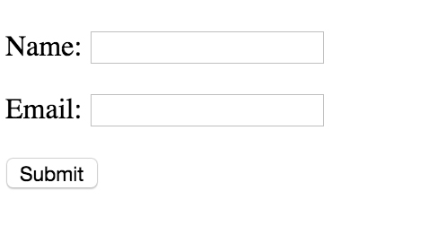
<form action="http://www.google.com" method="post">
    <p> <label for="name">Name:</label> <input type="text" name="name"> </p>
    <p> <label for="email">Email:</label> <input type="text" name="email"> </p>
    <p><input type="submit" name="Submit" value="Submit"></p>
</form>
Let's break down the above example
<input>'s change their look and feel based on the type attribute, on the above form we have two different types, text and submit<inputs>'s have a name attribute, this is important as it's tied to the inputted user value<inputs>'s can also have a value attribute assigned to them.<label>'s are specialists form elements used for marking form controls. Note how they have a for attribute tying them to a specific inputWe'll look more into laying out forms later, but notice how the inputs and labels are wrapped in
<p>tags. This is considered good practice
Some different inputs
Let's further look at some further form inputs:
<label for="rating">  Please enter rating   </label>
  <p><input type="radio" name="rating" value="excellent"> Excellent</p>
  <input type="radio" name="rating" value="good"> Good </p>
  <input type="radio" name="rating" value="bad"> Bad </p>
The buttons in the same group have the same name
If the user selects excellent, the server will receive: rating=excellent
Radio buttons let a user select ONE choice
Input - Check Box
- Similar to check boxes, however they allow MULTIPLE choices
<label for="rating"> What device do you use  </label>
  <p><input type="checkbox" name="rating" value="ipad"> Ipad</p>
  <input type="checkbox" name="rating" value="tv"> TV </p>
  <input type="checkbox" name="rating" value="video"> Video </p>
Drop Down List
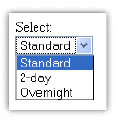
You can create a list using the
<select>…</select>tag, giving the items in the list by using the tagIf the user selects "Standard", the server side code will receive: shipping=1
Text Area
<label  for="suggestion"> Enter a suggestion </label>
<textarea name="suggestions" rows="5" cols="25">
my suggestions are:
</textarea>
- Used for multiple line inputs The attributes rows and cols specify the size
- The attributes rows and cols specify the si
HTML5 Form Validation
HTML5 allows us to instruct the browser to validate the form before it's sent to the server
We can use the required operator in order to specify a required field
<input type="text" name="Name" required>
We can use specific input types to further restrict the user choice
Some of the common HTML5 input types are:
- color
- date
- datetime
- month
- search
- tel
- time
- week
Laying out forms
We've already looked at how to create forms and sub form elements. This week we'll focus on how to style and lay out form controls.
Forms are probably one of the more complex structures that you'll encounter in HTML. Therefore, making them layout correctly can prove somewhat tricky.
It's important that we design usable and accessible forms:
- More people will be able to fill out your forms
- You'll get more customers and make more money
- Accessible forms lead to a better overall user experience
- Well coded forms can easily utilise analytics packages such as Google Analytics
In the next few steps we're going to go through a typical design process that would be used to layout a form.
1) The <fieldset> and <legend> elements
- The
<fieldset>..</fieldset>tag is used to group common form elements together
  <fieldset>
          <label> First Name </label> <input type = "text" name="firstName">
          <label> Last Name </label> <input type  = "text" name="lastName">
       </fieldset>
- We can use the
<legend> .. </legend>element to add a title to our<fieldset>
 <fieldset>
     <legend> Name </legend>
         <label> First Name: </label> <input type = "text" name="firstName">
         <label> Last Name: </label> <input type  = "text" name="lastName">
 </fieldset>

 <fieldset>
 <legend> Name </legend>
     <label> First Name: </label> <input type = "text" name="firstName">
     <label> Last Name: </label> <input type  = "text" name="lastName">
 </fieldset>
2) <p> tags can be used to create separate lines
Input elements and labels are inline, therefore we need to wrap them in a block level elements so they sit on their own line. The W3C recommend to wrap form elements in <p> tags in order create new lines.
<fieldset>
    <legend> Name </legend>
   <p> <label> First Name: </label> <input type = "text" name="firstName"> </p>
   <p><label> Last Name: </label> <input type  = "text" name="lastName"> </p>
</fieldset>

 <fieldset>
         <legend> Name </legend>
       <p> <label> First Name: </label> <input type = "text" name="firstName"> </p>
       <p><label> Last Name: </label> <input type  = "text" name="lastName"> </p>
</fieldset>
- Consider the following un-styled form
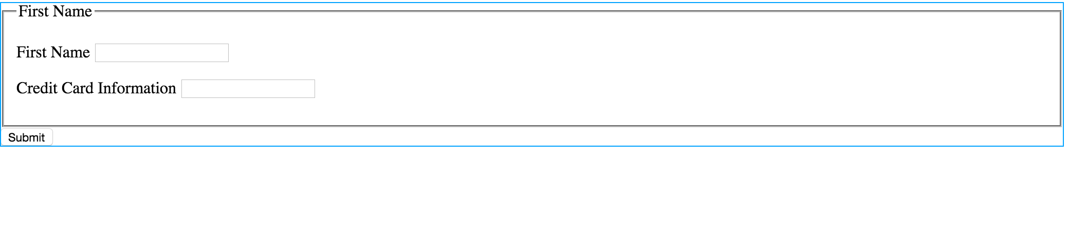
<form id="payment">
    <!-- personal details -->
    <fieldset>
        <legend>First Name</legend>
        <p><label for="firstName"> First Name </label> <input type = "text" name="firstName"> </p>
        <p><label for="credit_card_information"> Credit Card Information </label> <input type  = "text" name="credit_card_information"> </p>
    </fieldset>
    <input type="submit">
</form>
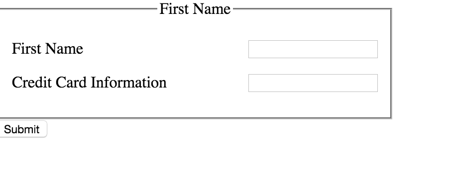
- Just like with HTML, we can take pragmatic steps to lay the form out
1) Give the form an ID
- In order to style this form we need to give the form and id
<form id="payment"> - We can now style this specific form using decent selectors e.g. #payment legend
{text-align: centre;}
2) Constrain the width of the form
- Currently the form is too wide, let's give it a
width:500px. Remember the<form>has an id attribute. We can use this to add styles
3) Align the inputs
- To solve this problem we need to float the text inputs to the right. The problem is we can't just say #payment input {float:right} because our button is also a input and we don't want to style this yet. We need to just target
<input type="text">in order to do this we can use the following CSS declaration:
  #payment input[type="text"] {
       float: right;
  }
You can change the
input[type="<insert type>"]to whatever type of input you want to targetOur text inputs are now aligned
Further Styling Of Inputs
- You can change the can border colour and width of text inputs by implementing the border property
#payment input[type="text"]
{
        border: 1px solid green;
}
- We can style our input button just like any other HTML element. Remember, we can change the text on the button from submit to anything we like by implementing the attribute
valuee.g.<input type="submit" value="GO!">
#payment input[type="submit"]  {
        border-radius: 4px;
        border: solid 1px black;
        font-size:20px;


}
Laying Out Styling Check And Radio Boxes
We can use
<fieldset>and optional<legend>to group together our related<input>'sJust like with any other input we can use
<p>tags to create a new line
<fieldset>
    <legend> Transport </legend>
    <p><input type="checkbox" name="vehicle" value="Bike">I have a bike<p>
    <p><input type="checkbox" name="vehicle" value="Car">I have a car </p>
    </fieldset>
</form>
Styling Valid Invalid Inputs
Remember in the last session, we looked at just how easy it is to validate forms using html5:
<input type="text" name="first_name" required>
You can specifically target valid and invalid form fields using the pseudo selector :valid and :invalid
input:invalid {
    border: solid red;
}

input:valid {
    border:solid green;
}
If you only want to display validation formatting when the form field is in focus (someone has clicked on it), we can use the focus: selector along with :invalid or :valid:
input:focus:valid {
          border:solid green;
 }